
When I saw the campaign logos for Hillary Clinton and Jeb Bush — two of the early front-runners in the 2016 presidential election — I was struck by how unusual they were.
So I sent them — along with logos from the campaigns of Ted Cruz, Marco Rubio and Rand Paul — to 14 people from varied fields including publishing, politics, finance, industrial equipment, non-profits, education and architecture. I asked them to grade the logos and explain the reason behind the grade.
I received wildly different reactions to Hillary’s and Jeb’s logos. Their logos seemed to both delight and disturb survey respondents. So please take a look at logos and compare your thoughts to the grades and comments below.
![]()
Hilary Clinton Campaign
C minus…Ugh…a FedEx arrow.
C…Looks like directional signage for hospitals. Should use “Hillary.” Everyone knows who that is.
D minus…I like the H and arrow, but it’s a graphic with an identity crisis.
C…Interesting, but what does the arrow signify? Moving to the right?
D…No idea what that is.
D…She should use her first name as her logo.
C…Someone should have killed this logo. It makes me think of FedEx.
D minus…I don’t know who sold her on this, but it’s terrible. It looks like a logo for a real estate firm.
D …It’s dumb. “Hillary” with an upward pointing arrow would represent her better.
C minus… Either “Hillary” or “Clinton” would work better than this International Harvester logo.
D minus…Took me a while to figure it out.
F…NO idea what that is. It looks like a company I should trade.
F…Looks like it was designed by a sophomore in high school.
D…I hate the arrow concept. It’s worn out its welcome as a non-subtle context clue.
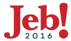
Jeb Bush Campaign Logo
D…Horrific for a candidate for President.
B…It looks like what a “Jeb” would do. Reminiscent of Jib Jab Hot Dogs.
B…People know who it is — instantly recognizable.
A…Good logo.
B…I like this one. No one needs to be reminded he’s another Bush. I like the exclamation point.
F…Looks like the logo for a new sitcom. Does not look presidential.
B+…The exclamation gets me excited for this Jeb guy.
F…Really? That’s his official logo? Jeb… if you’re running for leader of the free world, it’s time to let the “Billy Bob” nickname go. Design-wise, it’s kind of “blah.”
A …Short and cute; a name you can remember when you vote.
D…Why the exclamation mark? And the name “Jeb” does not inspire confidence. “Jeb Bush” is short enough to use together.
A…Simple and clean. The exclamation point sends it home.
F…Dumb. I think he and Hillary need to use their last names as well.
A…Pretty cool design and more new-age. I like the exclamation point.
D+…The exclamation mark is the worst. Don’t tell me what I need to be excited about.
Whether the Hillary and Jeb logos delight or disturb you aside, you better get used to them, because you’re going to see a lot of them. ##
##


Comment